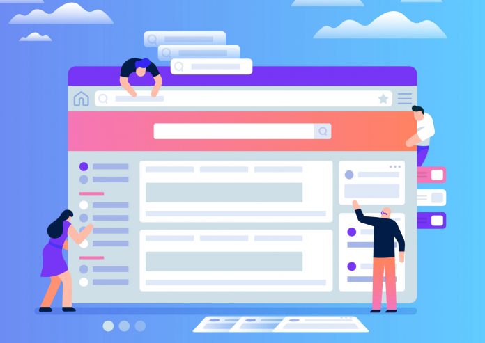
Are you a UI developer who is bored with trying out similar design patterns every day? Is your market falling down because your designs are monotonous and boring? Well, not to worry. We are here for you. Let us bring to you, the various design patterns that are quite popular so that you bring variety in your designs, satisfying your customer as well as quench your thirst for design knowledge.
So, let us dive deeper into the various design patterns that can make our website vibrant and sprightly.
Skeuomorphism
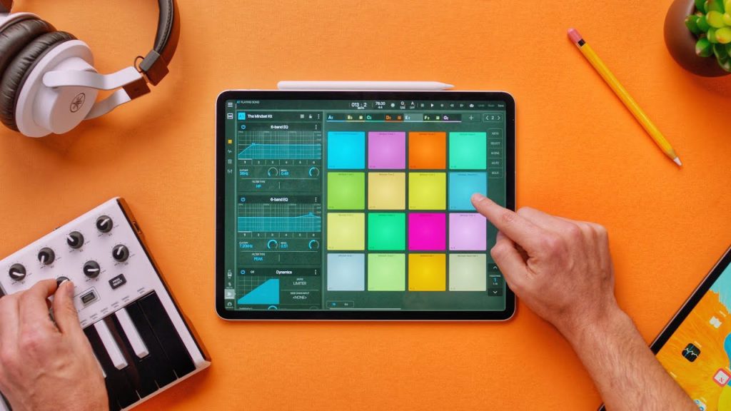
‘Skeuomorphism’ is a term that is used to describe the design pattern in which objects mimic their real-world counterparts, focusing on how they look and the flexibility of user interaction with these objects. All these objects are part of an interface. This makes it more real.
Thus, hola to the ongoing trend of Skeuomorphism, time to use it, Developers!
How does this help, at all? Well, first of all, when the interface objects mimic real-world objects, then as a developer, you can get the look and feel of how your user will feel. The second thing is, you will also develop an instinct of user experience that will make it better for the user.
An ideal example is that of the Recycle Bin, which is something the users recognize immediately. The term “Affordances”, used by ecological psychologist James Gibson can be related to this design pattern. The biggest reason is that the term refers to the actions that one can perform using objects. An example of affordance is a door handle button or push button – which really depicts what needs to be done with them, rotating or pushing. Users get a very intuitive direction on what action is expected from them.
As an example, Amazon’s Kindle Fire Tablet used Skeuomorphic design, along with 3D bookshelves, wooden texture, and so on.
Flat Design
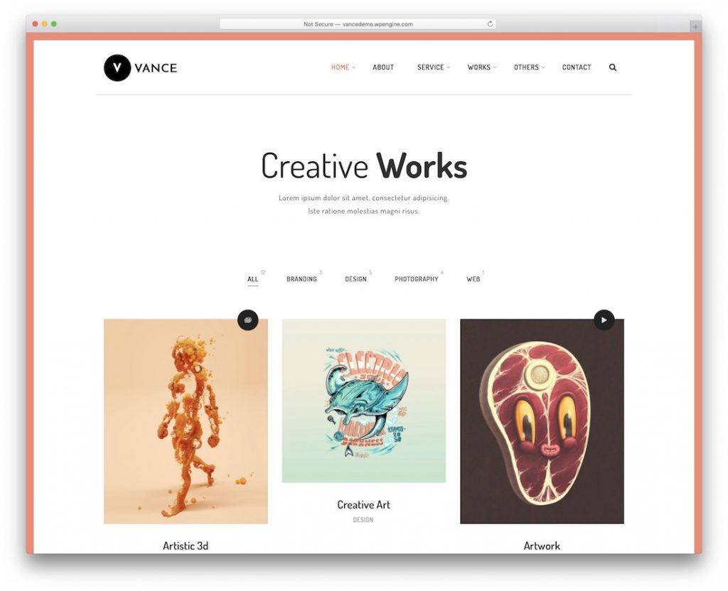
The Flat Design pattern has been present since time immemorial. Initially, this was used on most of the websites. Flat design was popular and easy to implement by the developers.
Let’s talk about the history of Flat Designs. Flat designs came into being once the developers took inspiration from the Swiss style. Josef Müller-Brockmann, the representative of the Zurich School of Arts and Krafts, can be called the founder of such a pattern. We can describe Flat Design style as:
The style favored simplicity, legibility and objectivity.
In this design pattern, we stress on Typography and Photography to a great extent. This is because, to make the website look more visually enhancing when the background pattern of design is just flat, it is best to use Typography and Colors.
What made Flat Design so popular? Flat designs became popular after Microsoft released Metro’s Design Language and Windows 8, in 2011. With Apple’s homepage adopting the Flat Design Style, the popularity of this rose to a different level altogether.
The prominent features of Flat Design are
1. Minimalism,
2. Functionality,
3. Avoiding grid system, textures, or complex forms,
4. Strict hierarchy with visual effects and typography.
Problems with the Flat Design
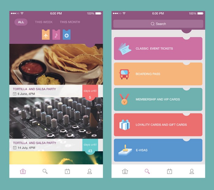
However, flat designs are not the best alternative. In fact, flat designs are going out of trend. Flat Design has several disadvantages which are as follows.
- It reduces the user’s reading efficiency.
- It does not render to the user’s needs of intuition, for the sake of preserving old antiques.
- No development for intuitively identifying linked elements on the User Interface.
Needless to say, Flat Designs are not here to stay.
Neumorphism
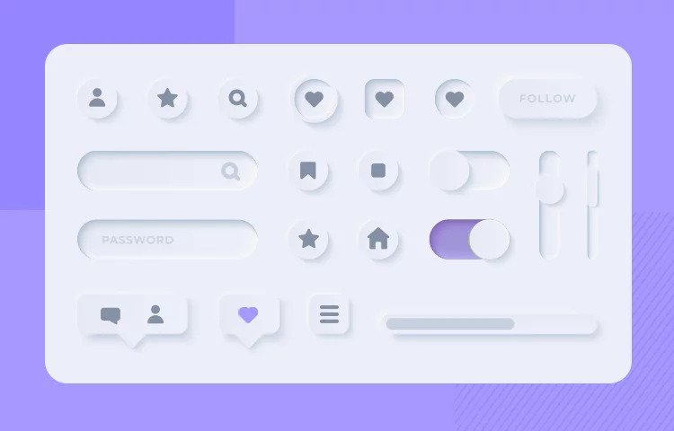
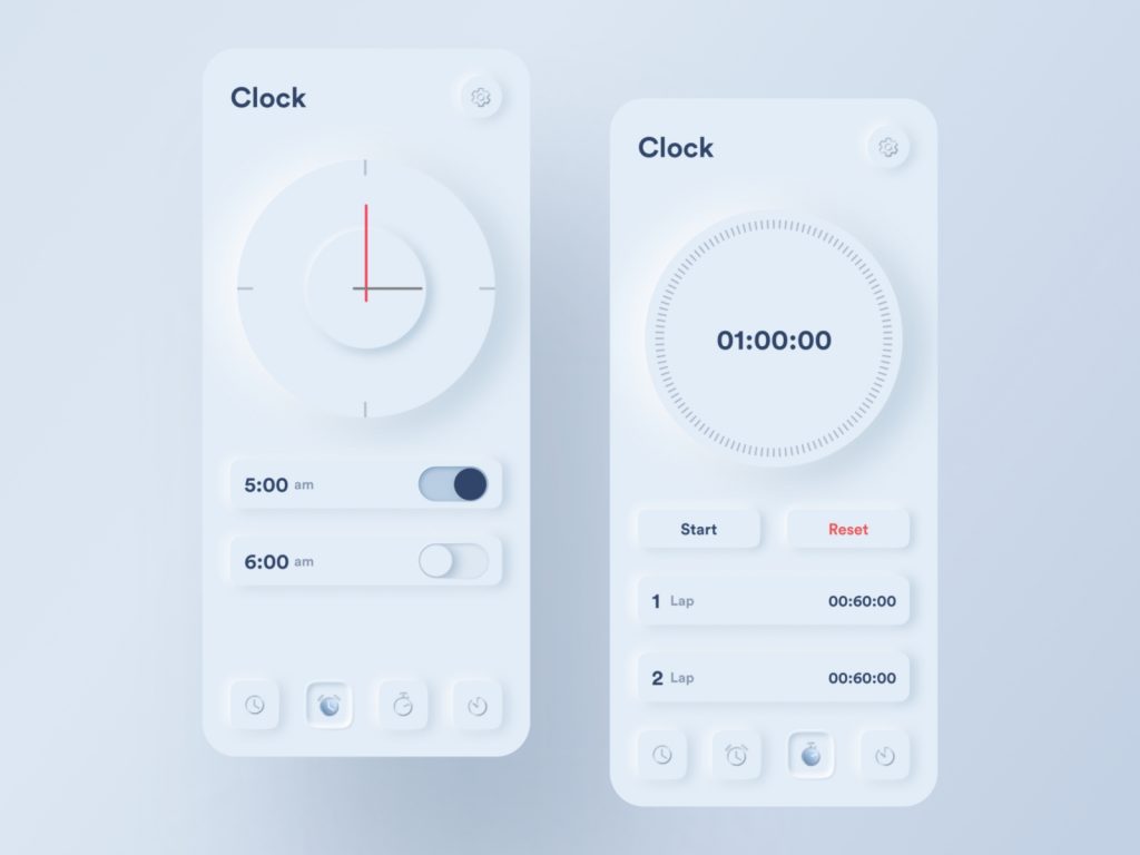
Welcome to my personal favorite style – Neumorphism. This UI Design is completely amazing and will just sweep you off your feet. As a matter of fact, Neumorphism is the hot word in the town.
We have spoken about Skeuomorphism. Neumorphism adds another layer to it. For instance, it adds to the colors palette and not just similarity between the UI objects and real life objects. As a result, Neumorphism adds to the user experience. Consequently, more people are attracted to your website.
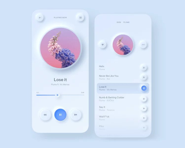
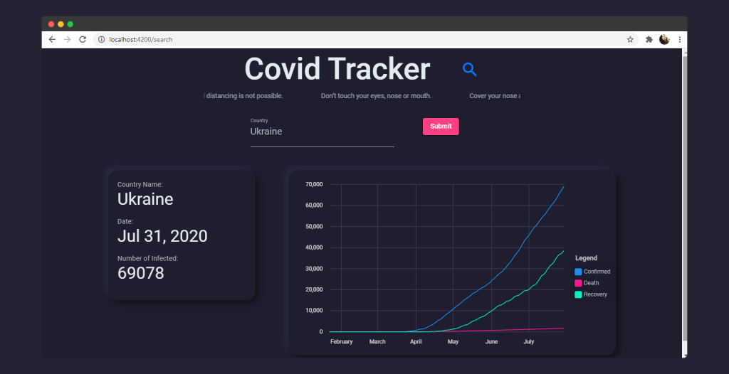
Firstly, let us talk about the effect it brings to the screen. The user feels that icons and buttons are part of the background that is just protruding from the screen and are not separate entities.
Neumorphism is a design pattern that comes in between flat design and skeuomorphism, though they are opposite to each other. A game of shadow and light, neumorphism definitely brings the best of both worlds.
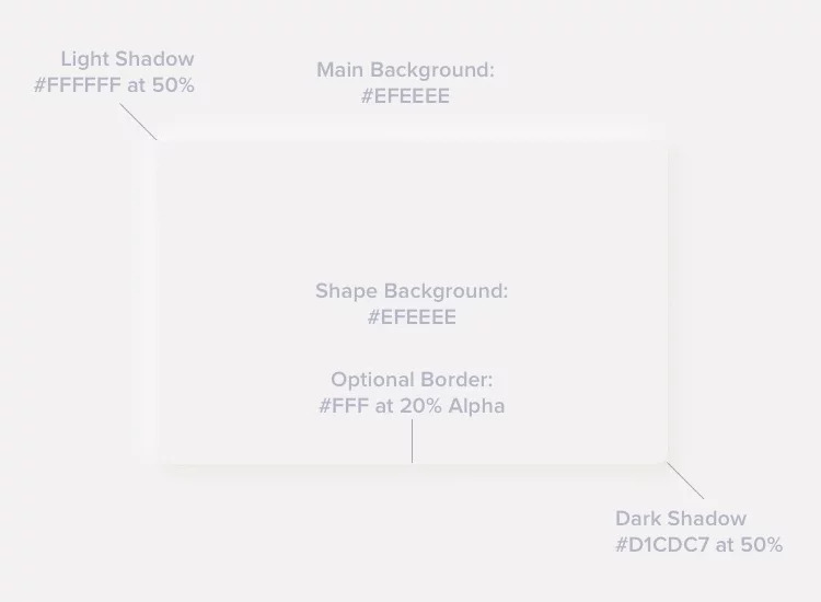
A big disadvantage of Neumorphism is that visually impaired users will have issues regarding this design style. Since this style is extremely subtle, visually impaired users will not be able to feel the effect that Neumorphism brings to the table.
Ruled Cards
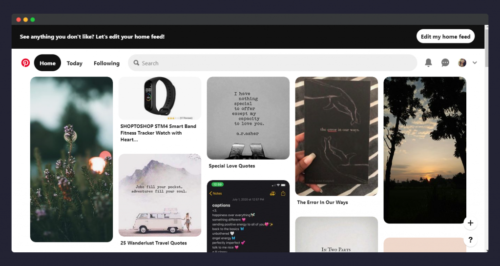
From Bootstrap to Material, cards are the best things that are present on the market. In fact, it has been in the market for a very long time. However, a new trend that has gained the attention of developers is Cards with Rules.
The reason why cards with rules are so very popular is that they are extremely well suited for the small screens. Talking about responsive web design, the ruled cards are one of the best things in the market right now.
Want to know a famous site that uses Ruled Cards? Our favorite, Pinterest. That speaks a lot, doesn’t it?
Some website who uses Ruled Cards is that of Newspaper, Real Estate, Weather, and so on. All of them, well at least most of them have really taken their inspiration from Pinterest. They come in all shapes and sizes as per the requirement of the user, giving the user the best experience.
Glow UI
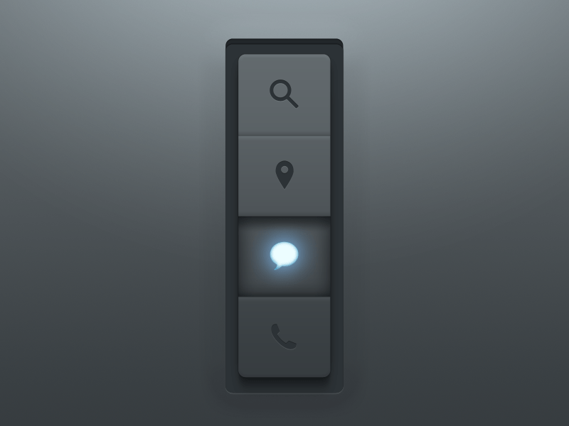
If implemented well, Glow UI is a complete 10/10. Otherwise, it is just a mess. Just as the name suggests, as a matter of fact, this UI design pattern is extremely beneficial as it gives the user a matte feeling. Apart from this, it is also soothing to the eye.
Glow UI can also be incorporated along with Neumorphism to give a better look and feel. Suited to the dark mode, it can also be applied to the light mode. As a matter of fact, Glow UI in light mode is reflected differently on the Night Mode, and differently without the night mode, if designed efficiently.
This design pattern not just gives the right amount of comfort to the eye, but also provides strong intuition to the user, enhancing the user experience.
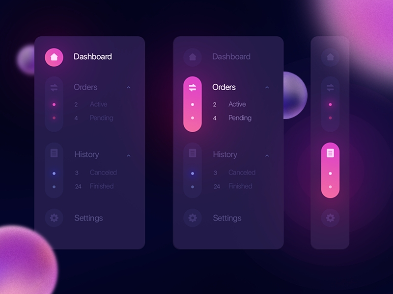
However, the biggest disadvantage of Glow UI is, it needs practice and can only be achieved with the right amount of practice to understand where this needs to be used, and where not.
Also read Starting a Career in UI UX Design: The Ultimate Guide
Minimalistic UI Design
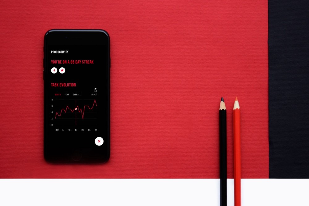
When less is more, Minimalism is the UI Design for you. Short does not at all mean little for you, and you finally do not need more space, all you need is really is fewer elements.
Talking about the history of Minimalism, the popularity of Minimalism rose into heights in New York around 1960s. The inspiration of minimalism started abstracting geometric construction from painting and sculptures. One of the main mottos of Minimalism is keeping the necessary features yet maintain the extensive elegance.
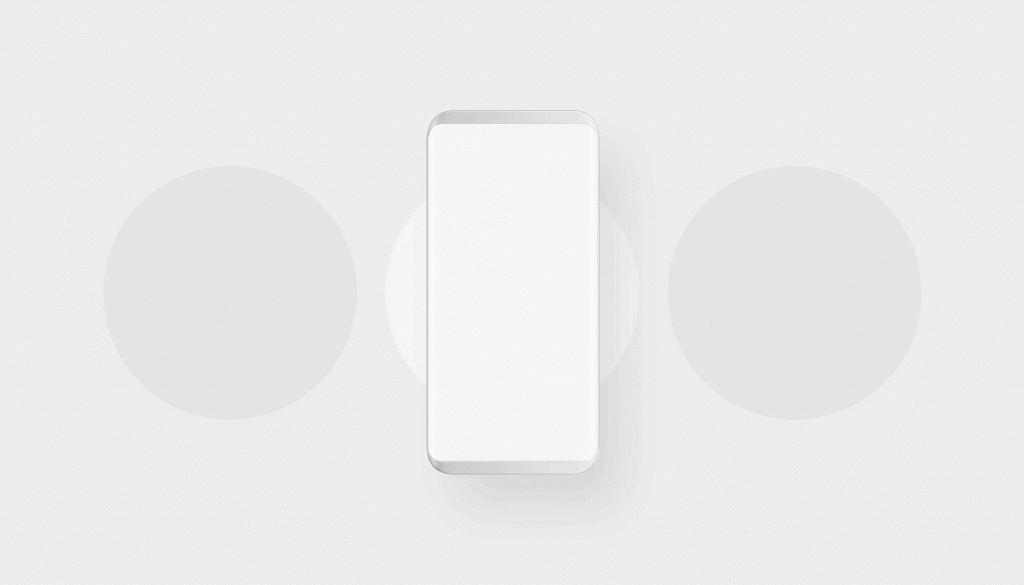
The characteristics of minimalism are, clarity, simplicity, a lot of spare space, correct typography, eliminating complex decorative elements. Minimalist UI makes your site look sophisticated, uncluttered, and extremely aesthetic.
Using a monochrome or limited color palette, keeping a flat design, avoiding Neumorphism or Skeuomorphism can help in providing a minimalist design.
Material Design
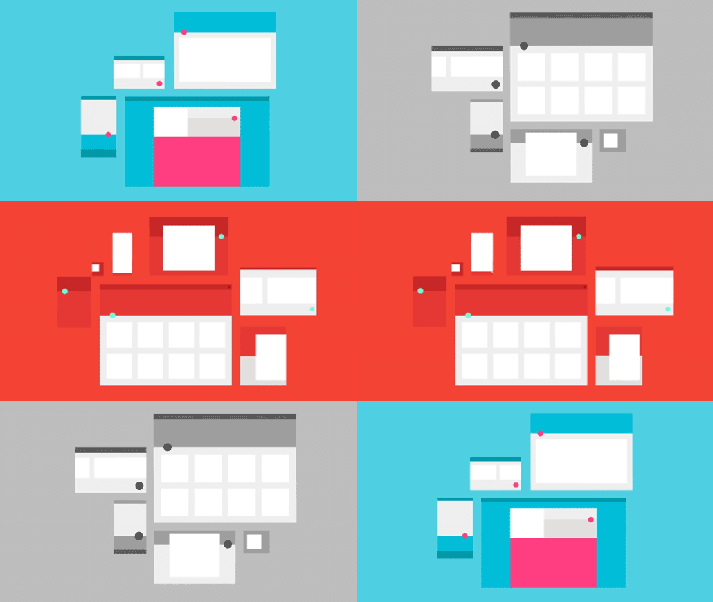
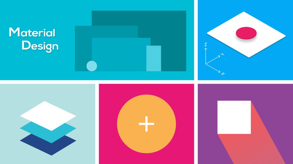
Material Design and flat design is always having a tug of war, in today’s design pattern. As a matter of fact, Material design can be considered as the evolution of the flat design. While the flat design does not leverage the theme of Skeuomorphism, ‘Material design’ uses the subtly.
Google came up with material design documentation a few years back and it discussed the guidelines, principles, and purpose of material design. Material design helps in making a website very responsive and it provides a set of guidelines as it makes the task of developers much easier.
Also read 22 Best Freelance Jobs Opportunities to Earn from Home
Custom Illustrations

Though Custom illustrations cannot be specifically called a design pattern, however, it is one of the best trends in UI/UX design, today. Most of the time, illustrations are used to depict the visualization that the designer wants to portray. As a matter of fact, illustrations are perceived quicker as well as gain the attention of the user more effectively.
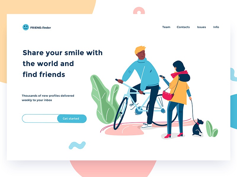
In combination with typography, Custom Illustrations can be used to enhance the visual hierarchy. Custom Illustrations enables synchronization between artistic harmony and originality.
Split Screens
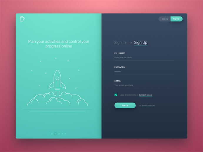
Split Screens is one of the most used features today as far as flat web design is concerned. In fact, split screens are not just visually attractive, but it also enhances the contrast between two different objects, brings forth features that are worth noticing.
The contrast clearly helps one define differentiating elements and services that are offered by an organization, which is the reason Split screen are so vastly used in website design. As a matter of fact, the split screen design has brought forward more opportunity for the designers to highlight variety of elements on a single go.
Animated Graphics
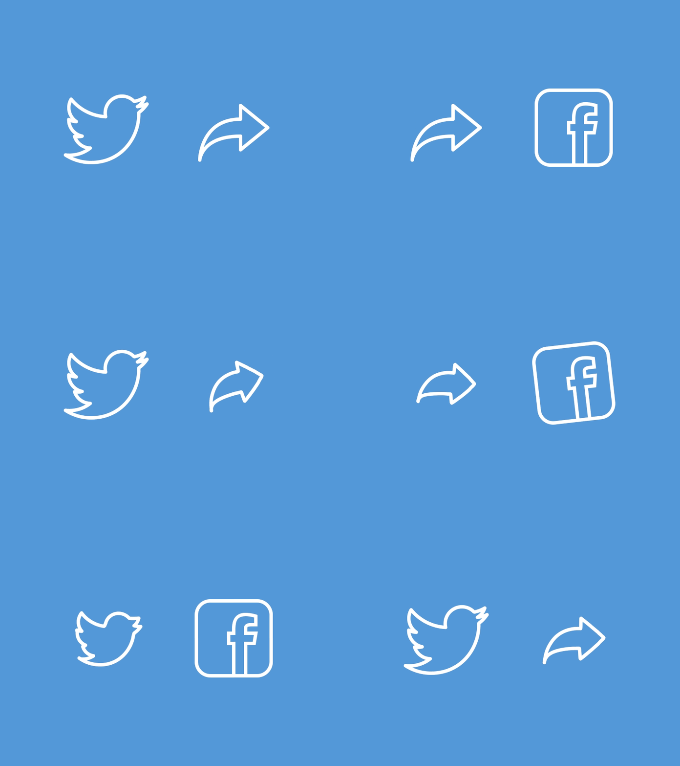
As an extension of custom illustration, Animated Graphics are also taking up a lot of space today as part of UI design. In fact, just like gif, creative experiments in the field of Graphics as a designer has brought forth a transition. It saves us from boring monochromatic design and helps us focus on the necessary stuff.
Animated icons, sophisticated visuals and and simplifying complex icons into a simple structure through animations has been one of the biggest UI trends in the past two years. Kudos to the designers. This even add to the User Experience.
Concluding, it is true to say that design styles will keep on evolving, and learning them and implementing them is so much fun! Let’s learn them and applying them to our application.


